Designing an AI-assisted review flow to add a review in seconds
A walkthrough of how we redesigned noon's review-submission flow: from digging into why almost nobody writes reviews, to shipping an AI-assisted flow that turns a few taps into a finished review.
Before: the old flow, a blank text box and a photo upload
Role
Product Designer Intern
Collaborators
Context
What is noon?
noon is the Middle East's homegrown online marketplace, selling everything from electronics and fashion to daily groceries, and serving millions of shoppers across Saudi Arabia, UAE, and Egypt.

Why redesign the reviews & ratings flow?
Reviews are the closest thing to picking an item up in a store; they build the trust that turns a browse into a buy.
They flag weak catalog before ops ever does.
They feed the ranking that surfaces good products to shoppers.
Photo and text reviews carry the most weight: shoppers who reach a review convert about 59% more often than those who don't.
But almost nobody writes them: only about 1 in 69 shoppers who views a product leaves a review (~1.46%), a rate that barely moves day to day.
| Exposure group | PDP sessions | ATC count | PDP-to-ATC conversion rate |
|---|---|---|---|
| Exposed to Review | 11.7M | 1.95M | 16.67% |
| Not Exposed | 52.0M | 5.46M | 10.49% |
Getting started
Figuring out why nobody writes
Before touching a single pixel, we wanted to understand the drop-off, so we looked outward at how other apps do it, inward at what our shoppers were telling us, and hard at the data to name the real blocker.
What the best apps do differently
Inside e-commerce, there was barely any innovation to borrow: across Amazon, Myntra, and Meesho, every review flow looked more or less the same, a star rating, a blank text box, and an add-photos container.
The fresh thinking was elsewhere. Apps like Bolt, AllTrails, and TripAdvisor break a review into a few tappable questions instead of a blank page, and that guided-prompt approach is what we set out to bring to noon.
What shoppers actually told us
When we talked to friends and people on the team, the same feedback kept surfacing: they just don't write reviews. From their point of view it's a high-effort, low-impact task, a lot of typing for little payoff, so the intent to help never turns into an actual review.
The problem & the idea
Problem
Most shoppers rate but never write. The blank text box is the blocker: writing feels like effort, so the reviews that actually sell rarely get created.
Solution
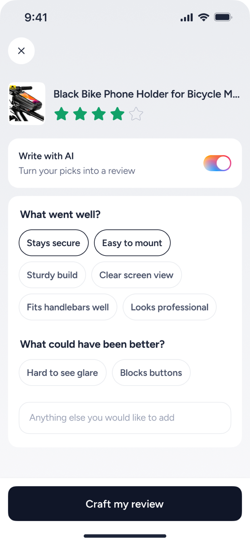
Shoppers already tap to give a star, so the whole flow works the same way: tap, tap, done. They pick a few rating-aware chips and AI turns them into a real review they can post in seconds.
Iterating on the input
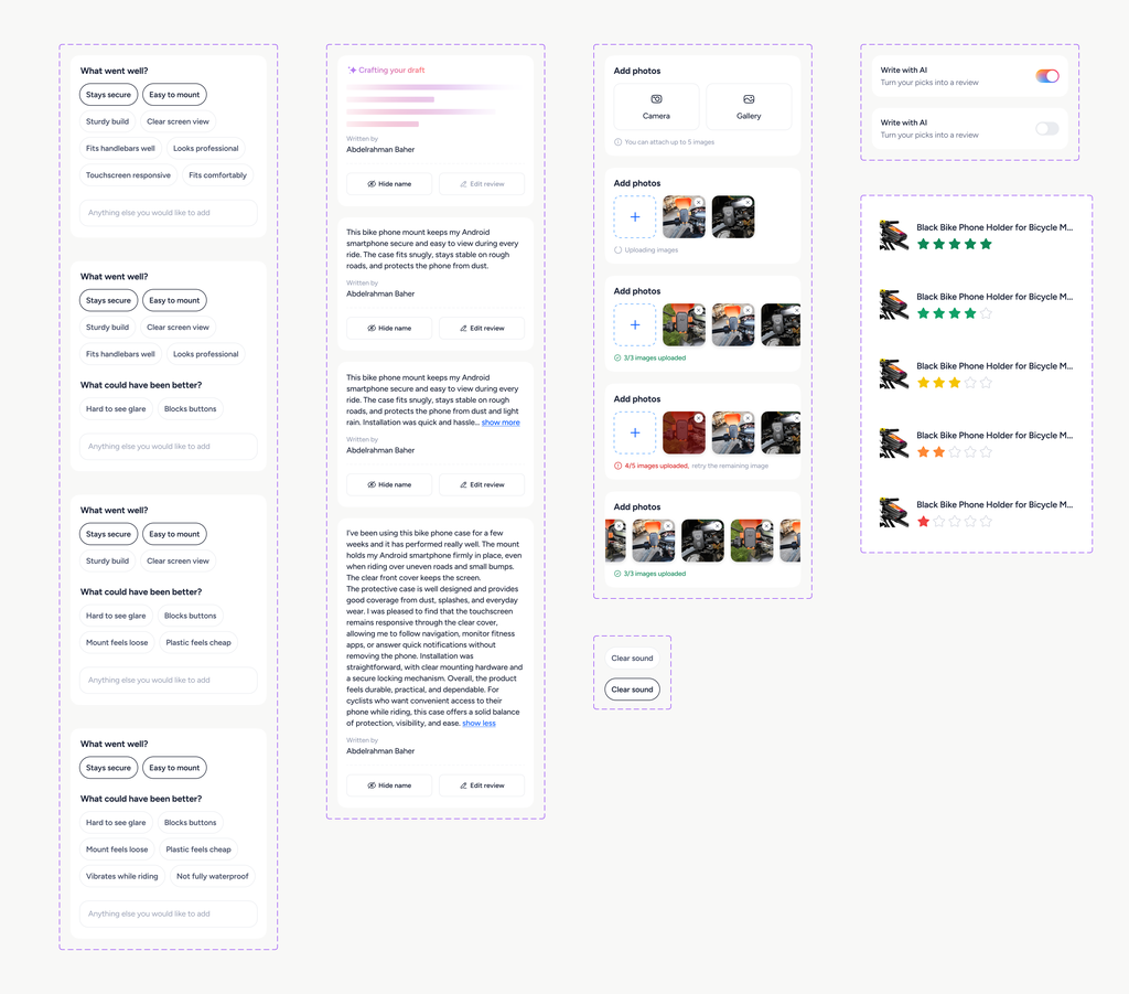
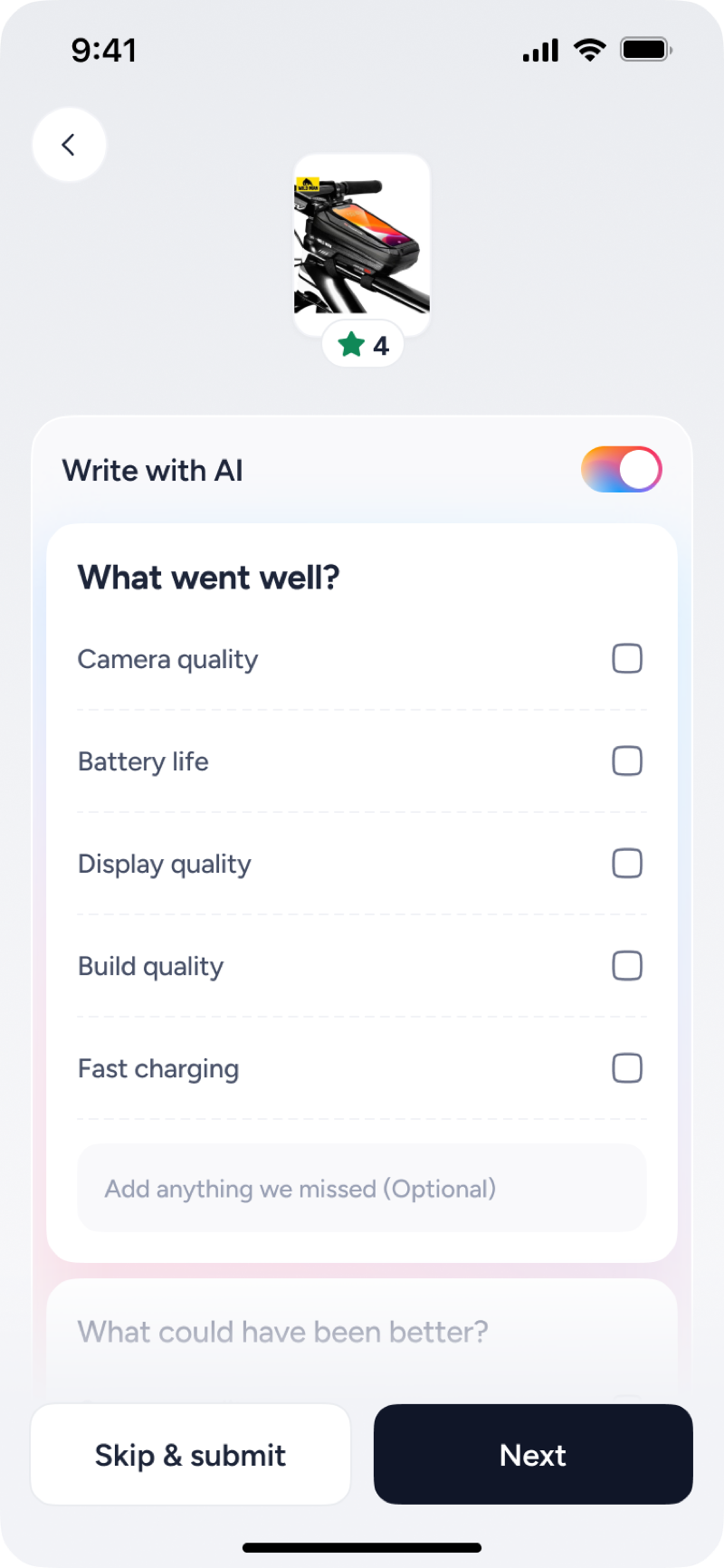
Before the chips landed, we ran through several layouts for capturing what a shopper wants to say, from plain checkboxes to grouped chips, each tuned for focus and speed. Here's how it evolved.
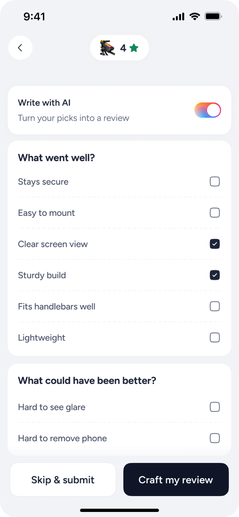
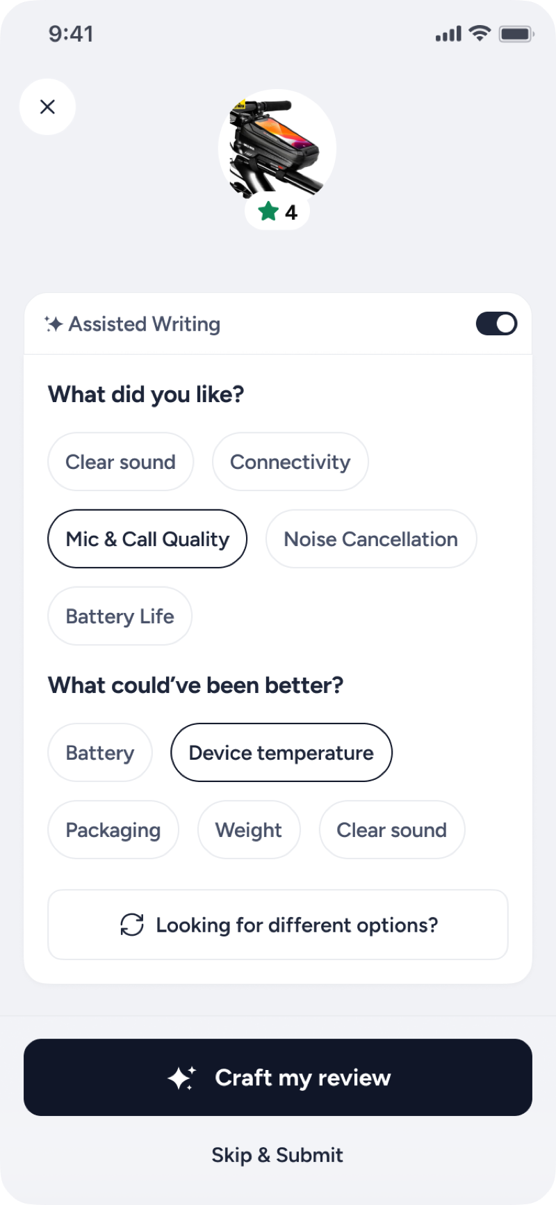
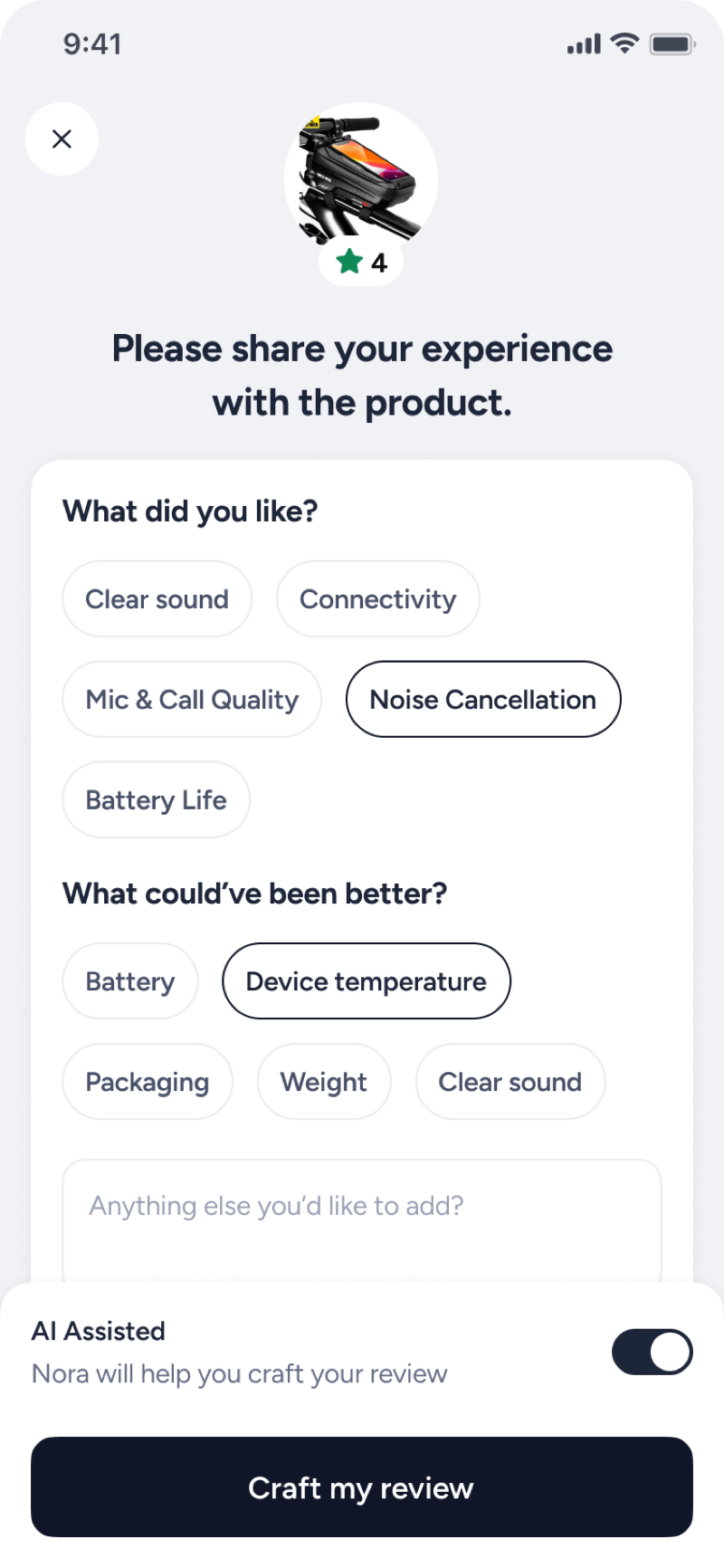
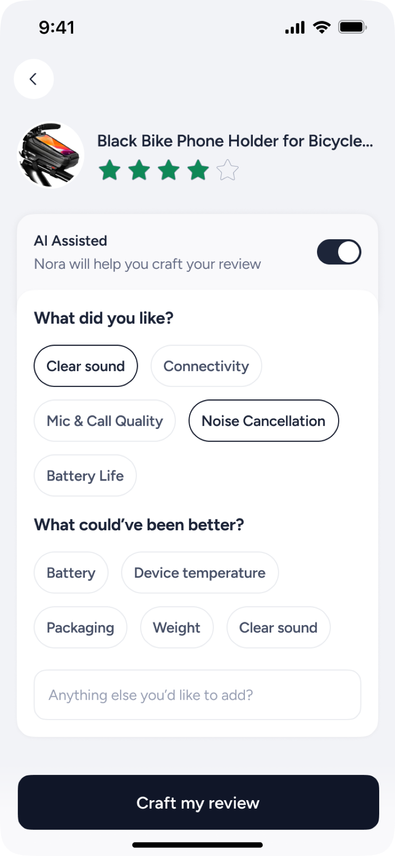
Rating-aware question chips
Eight parameters, split by the rating you give: all positives at 5 stars, all improvements at 1, a mix in between. You just tap what fits; there's no blank page to stare at.
| Star rating | What went well? | What could have been better? |
|---|---|---|
| 5 | 8 chips | None |
| 4 | 6 chips | 2 chips |
| 3 | 4 chips | 4 chips |
| 2 | 2 chips | 6 chips |
| 1 | None | 8 chips |
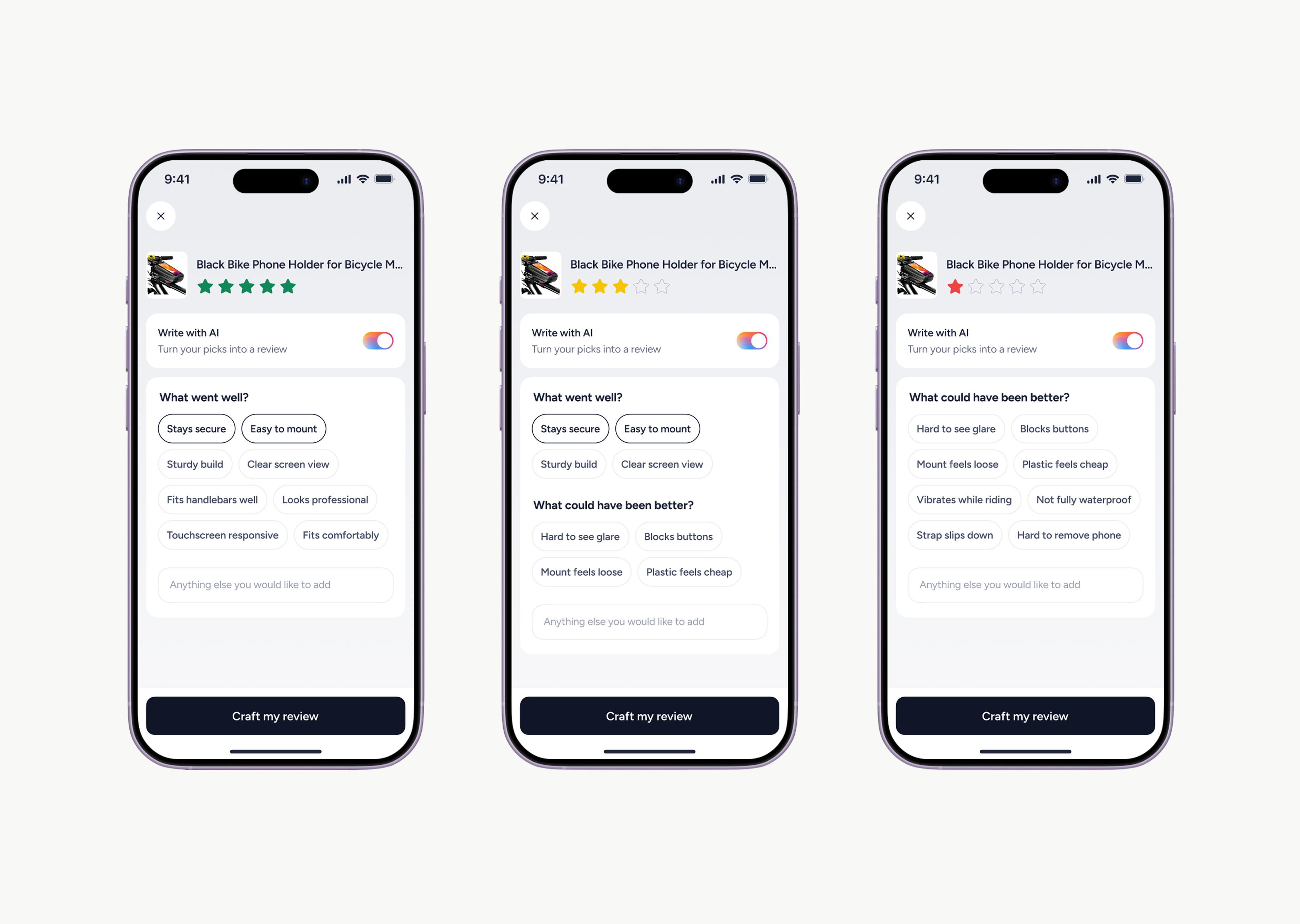
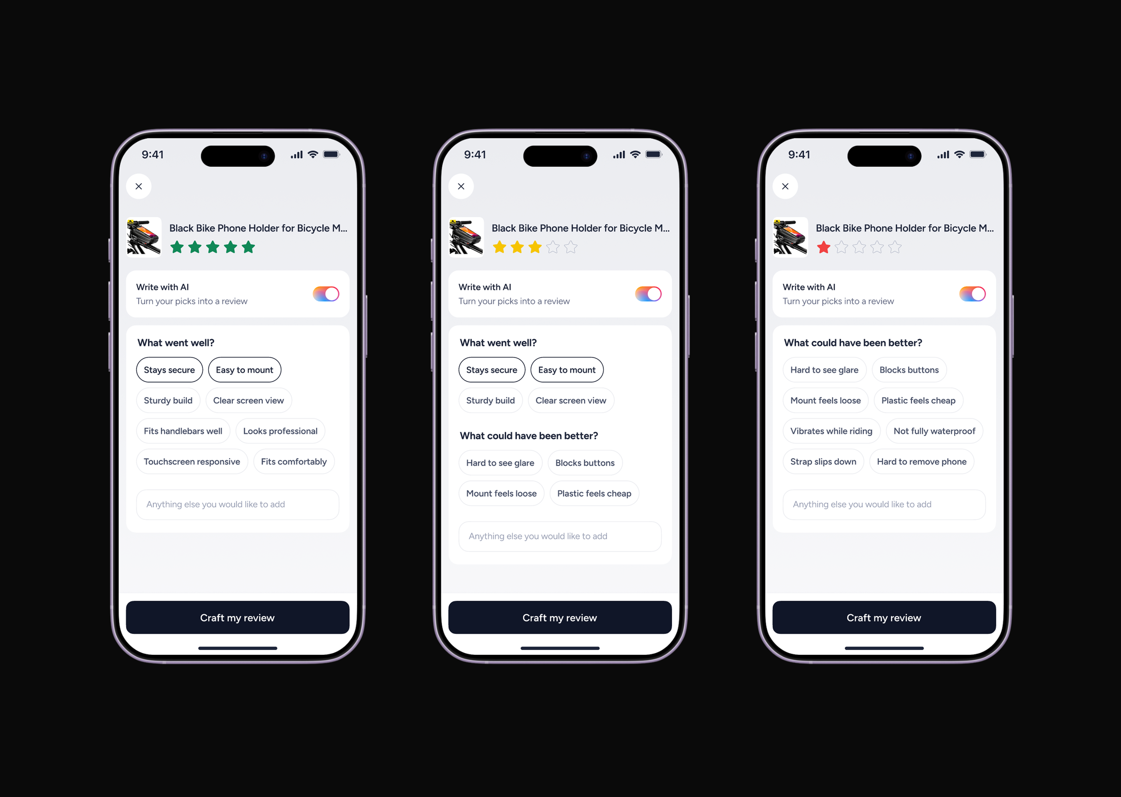
The same 8 parameters, split by rating (5★ → 1★)
Two ways to write a review
Now there are two ways to write a review: an AI mode, where AI turns your taps into a first-person draft you can post or tweak, and a Manual mode, for writing it yourself. Either way, there's no blank page to start from.
AI mode: tap a few chips and AI writes the review
AI Experiments
Three ways to edit the draft
A generated draft only helps if editing it feels effortless, so we prototyped three editing patterns as working React screens with the help of Claude. Two things mattered most:
Focus on the input: the user's attention should stay on the text box, with nothing competing around it.
Smooth scrolling: as the review runs longer, scrolling inside the input should stay smooth and natural.
All three approaches below solve for this, but B felt the most intuitive, so that's the one we moved forward with.
Process
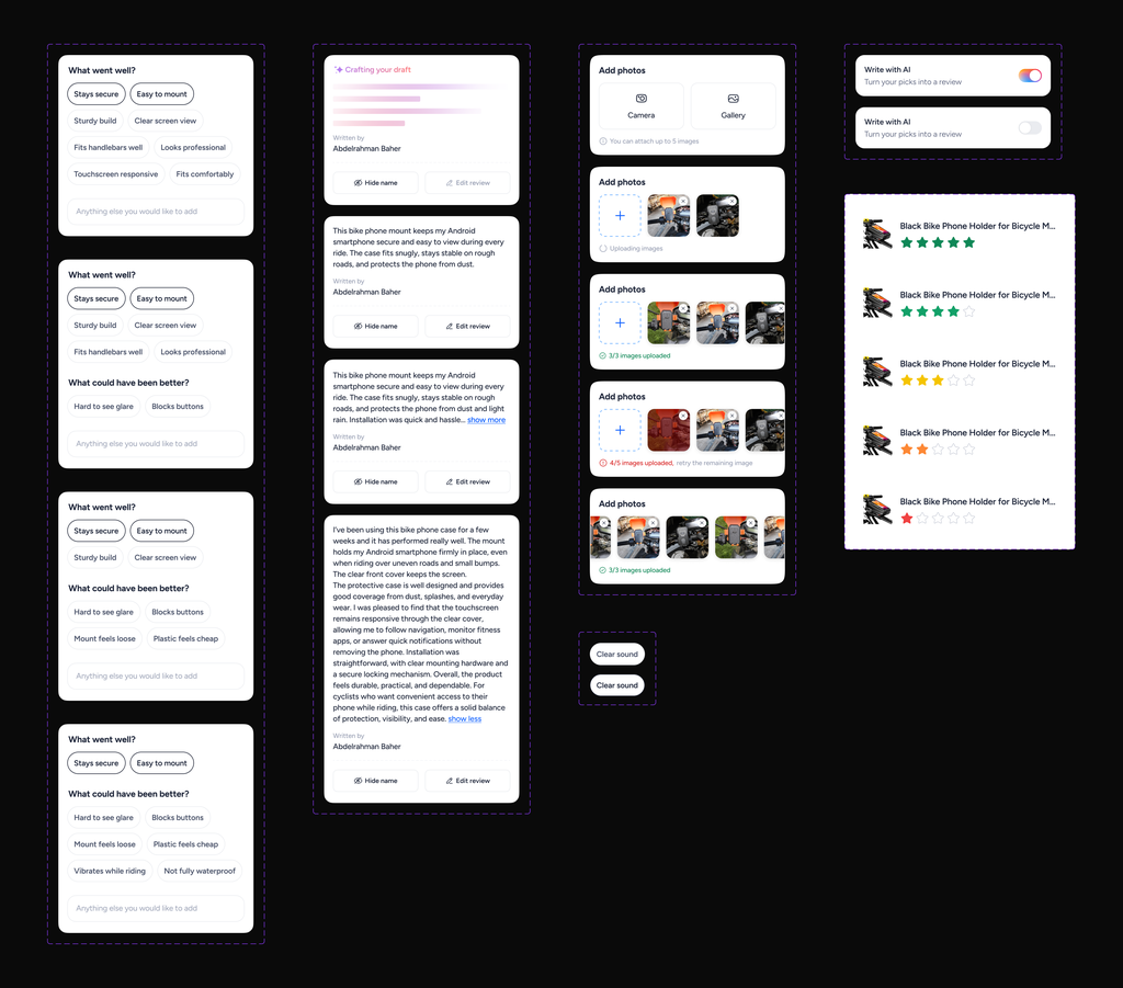
A design system, heading into testing
To keep the whole flow consistent as it scales, we built a design system behind it: chips, toggles, AI states, photo-upload states, and review cards. Every screen ships from the same parts, so the experience stays coherent as the feature grows. It's in development now, heading into usability testing.