Rebuilding Ambitio's dashboard to drive 14% more adoption
Ambitio helps students applying abroad go from 'where do I even start' to a submitted application. I redesigned the core dashboard end-to-end (the flow where students discover programs, track applications, and prepare their documents), turning a dense, feature-heavy product into a clear, guided journey.
Role
Product Designer Intern
Problem
The product held everything, but told no clear story
Applying abroad means juggling dozens of programs, documents, deadlines, and scholarships. Ambitio had grown feature by feature, so all that data lived in the product but with no clear hierarchy or next step. Screens were dense and generic, statuses were unclear, and students still fell back to spreadsheets and WhatsApp, which is exactly why the dashboard was underused.
- 1
Dense, generic screens
Detail pages had bloated over time and data points were generic, so students couldn't quickly judge fit, or even tell what was clickable.
- 2
No single source of truth
Application statuses, deadlines, and required documents lived in different places, so a student could never see, at a glance, where each application actually stood.
- 3
Documents stalled in limbo
SOPs, LORs, and essays had no clear owner or status, so work quietly stalled and nobody knew what was blocking a submission.
Outcomes
One clear journey, and a dashboard students return to
Restructuring the product around the applicant's real journey (discover, apply, prepare, fund) moved the metrics that mattered.
Dashboard weekly-active adoption
Faster to the next action
'What do I do next?' support queries
Solution
Rebuild the product around the applicant's journey
Instead of a pile of features, I organised everything into four clear steps (discover, apply, prepare documents, and fund), and gave every screen an obvious status and next action.
1 · Discover programs you're actually eligible for
Course Finder surfaces programs with the few things that drive a decision (ranking, tuition, acceptance rate, deadline, and a clear 'Eligible' tag), so students shortlist with confidence. Program detail pages lead with those decision-drivers instead of a wall of generic data.
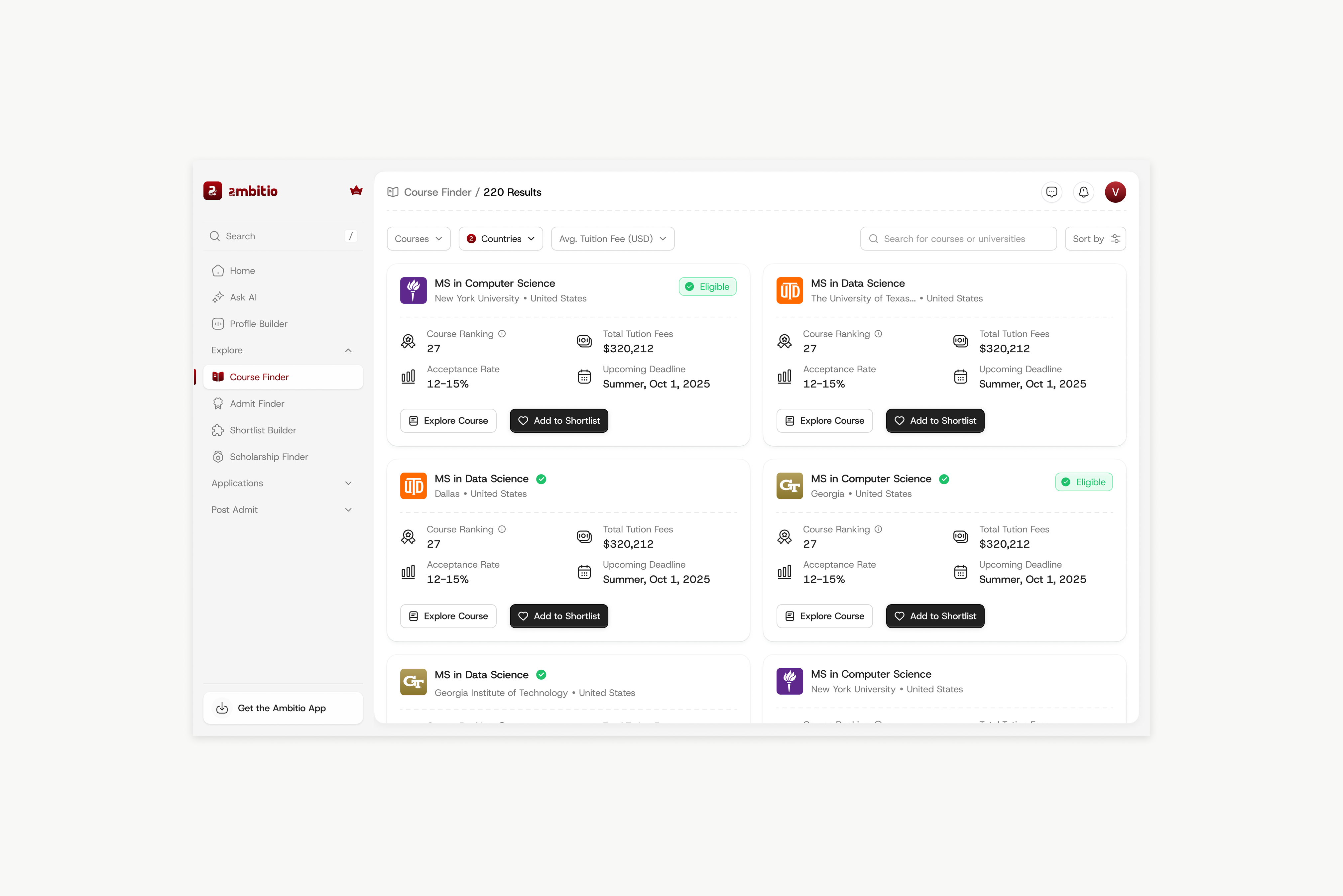
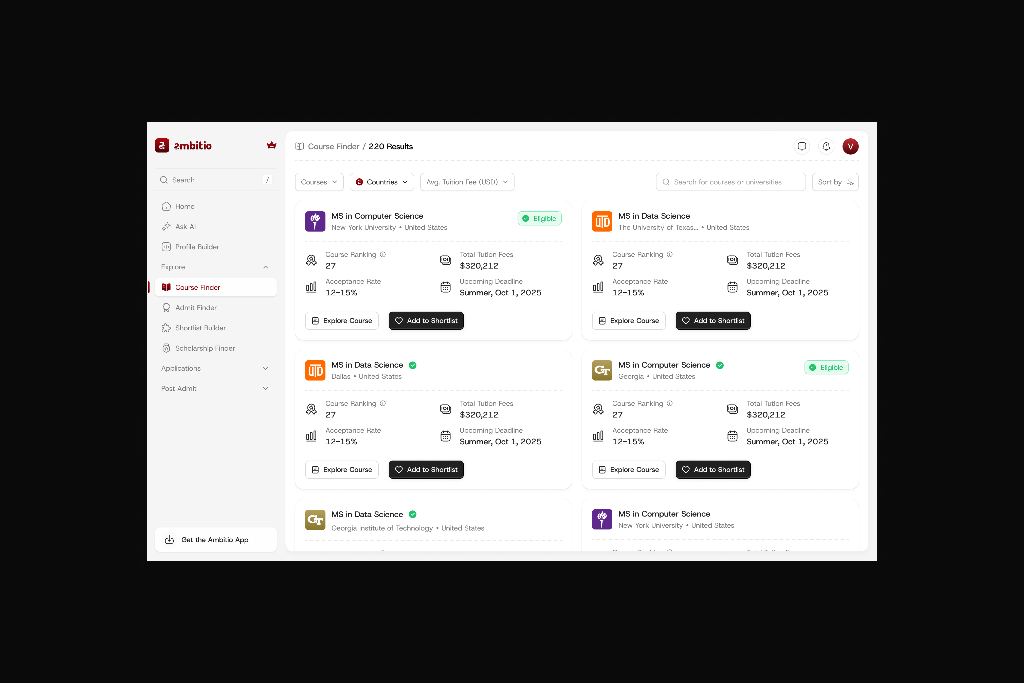
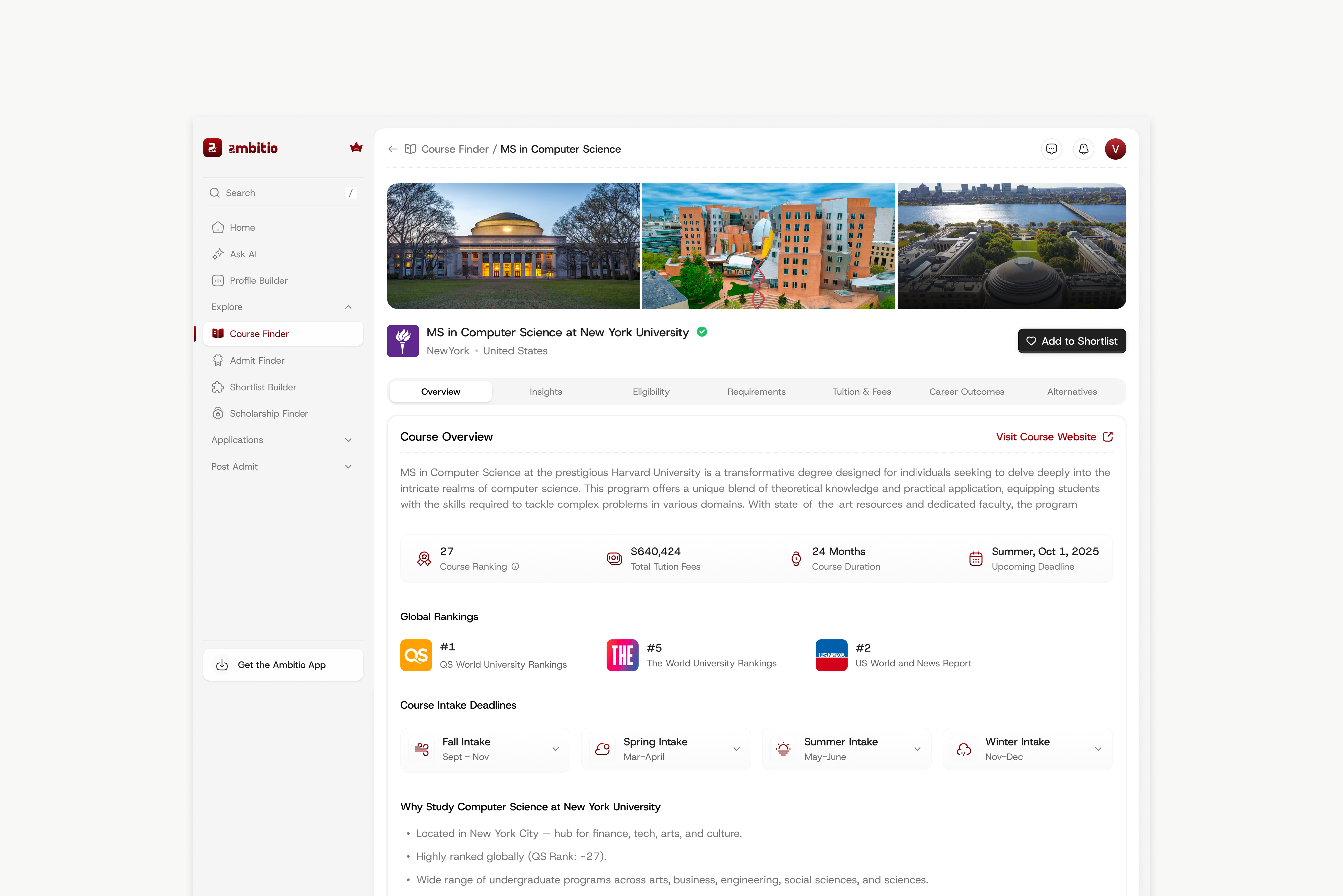
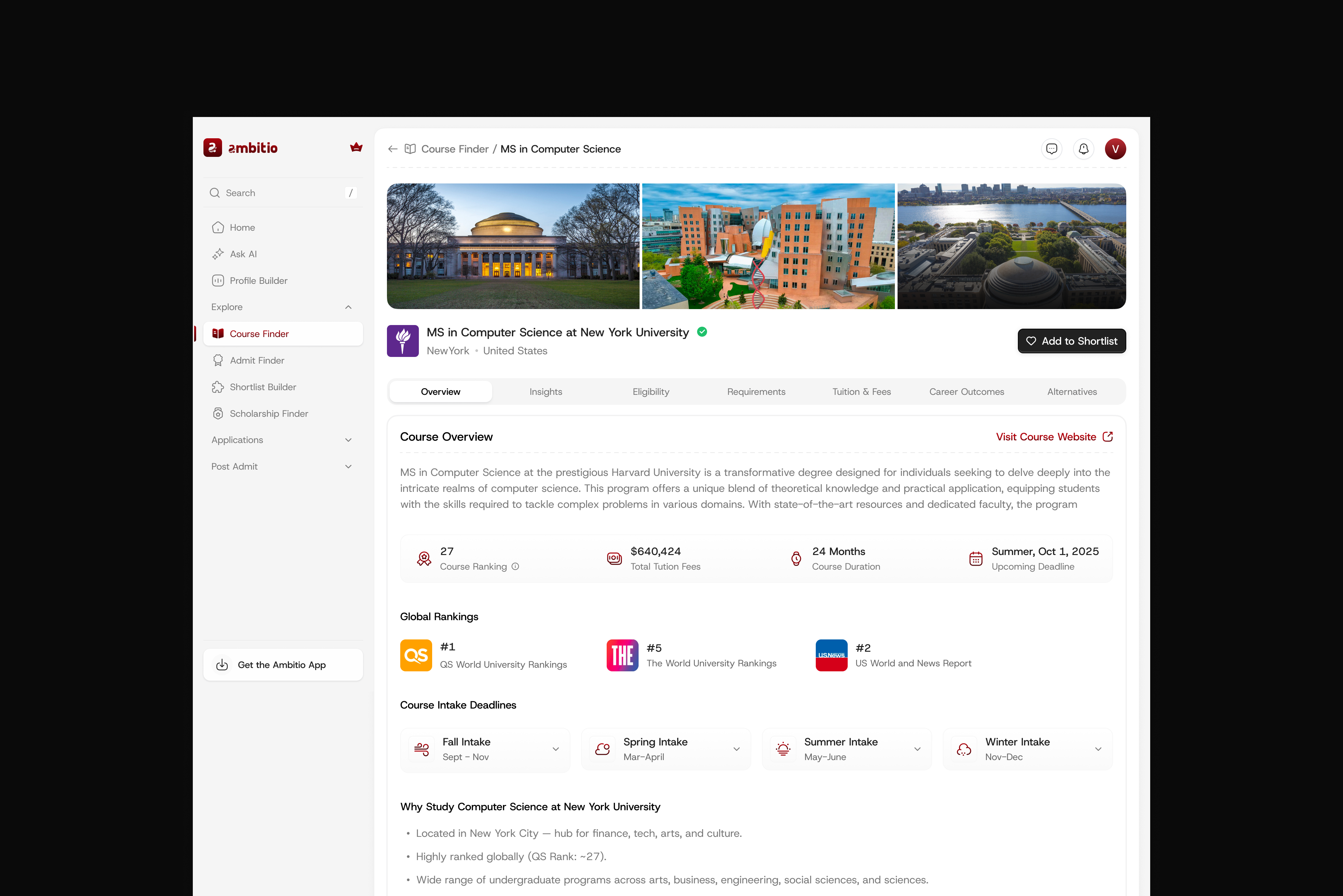
Course Finder and program detail: decision-drivers up front
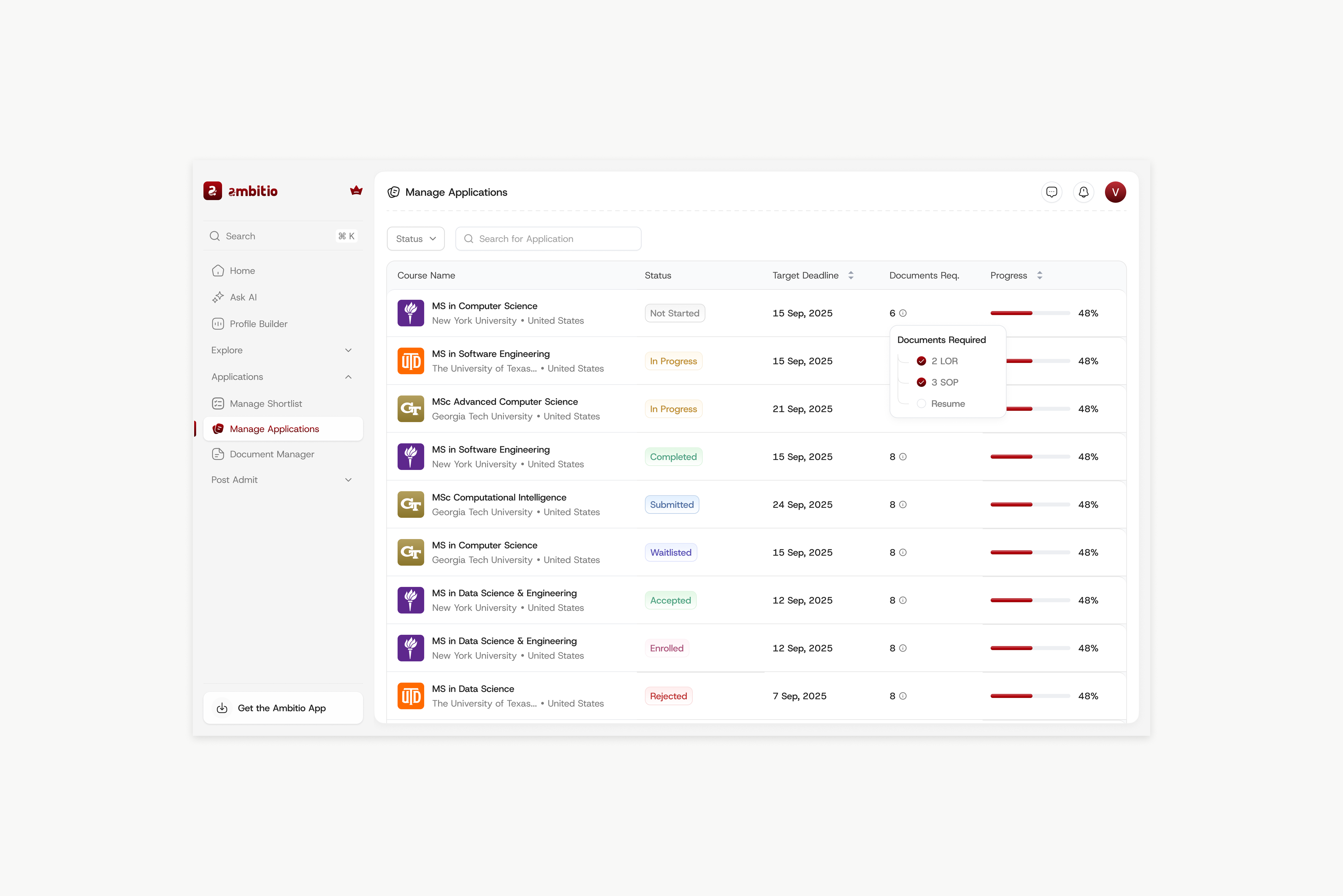
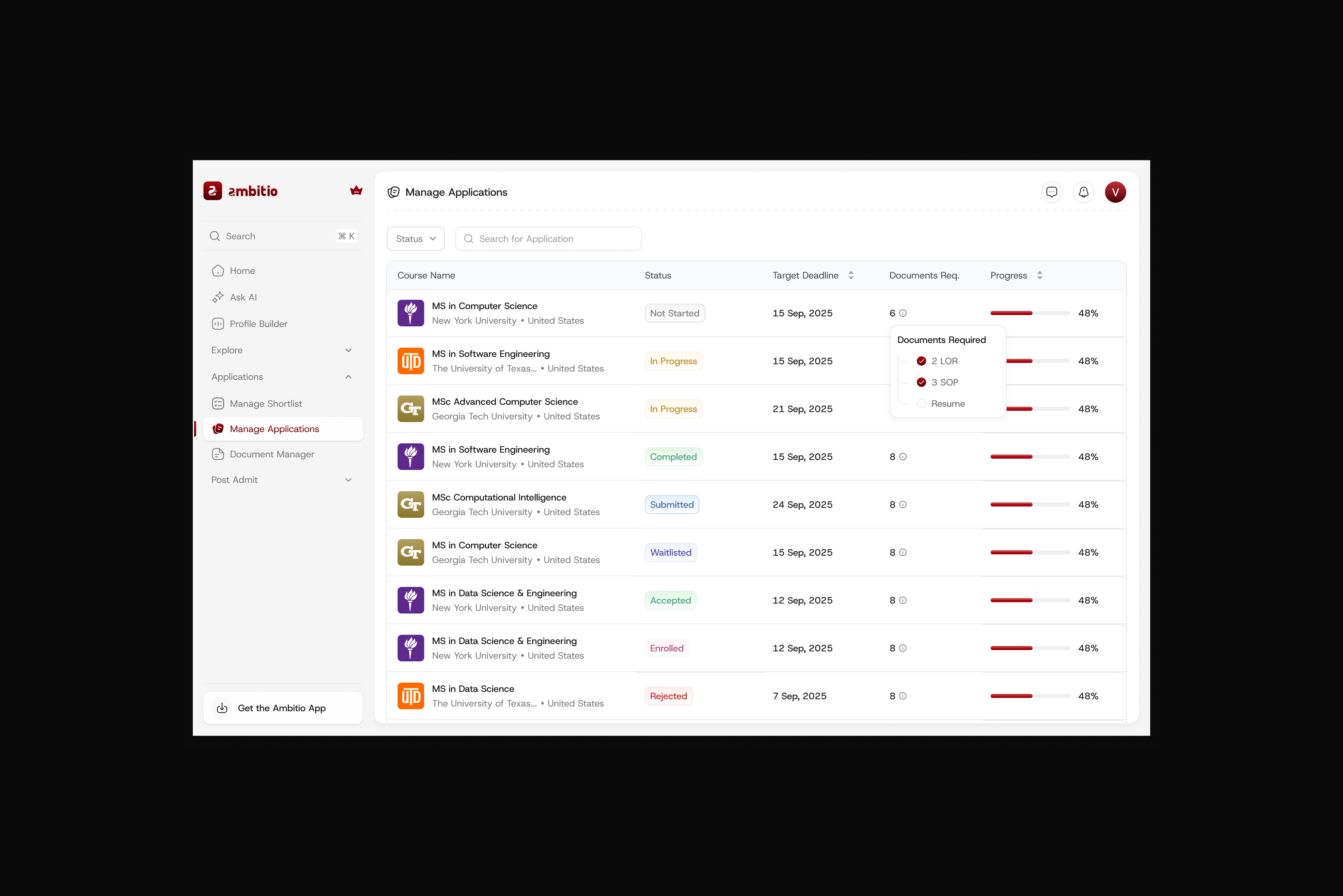
2 · One dashboard for every application
Manage Applications puts every program in a single view with its status (Not started → In progress → Submitted → Accepted), target deadline, documents required, and a progress bar, so students always know exactly where each application stands and what's left to do.
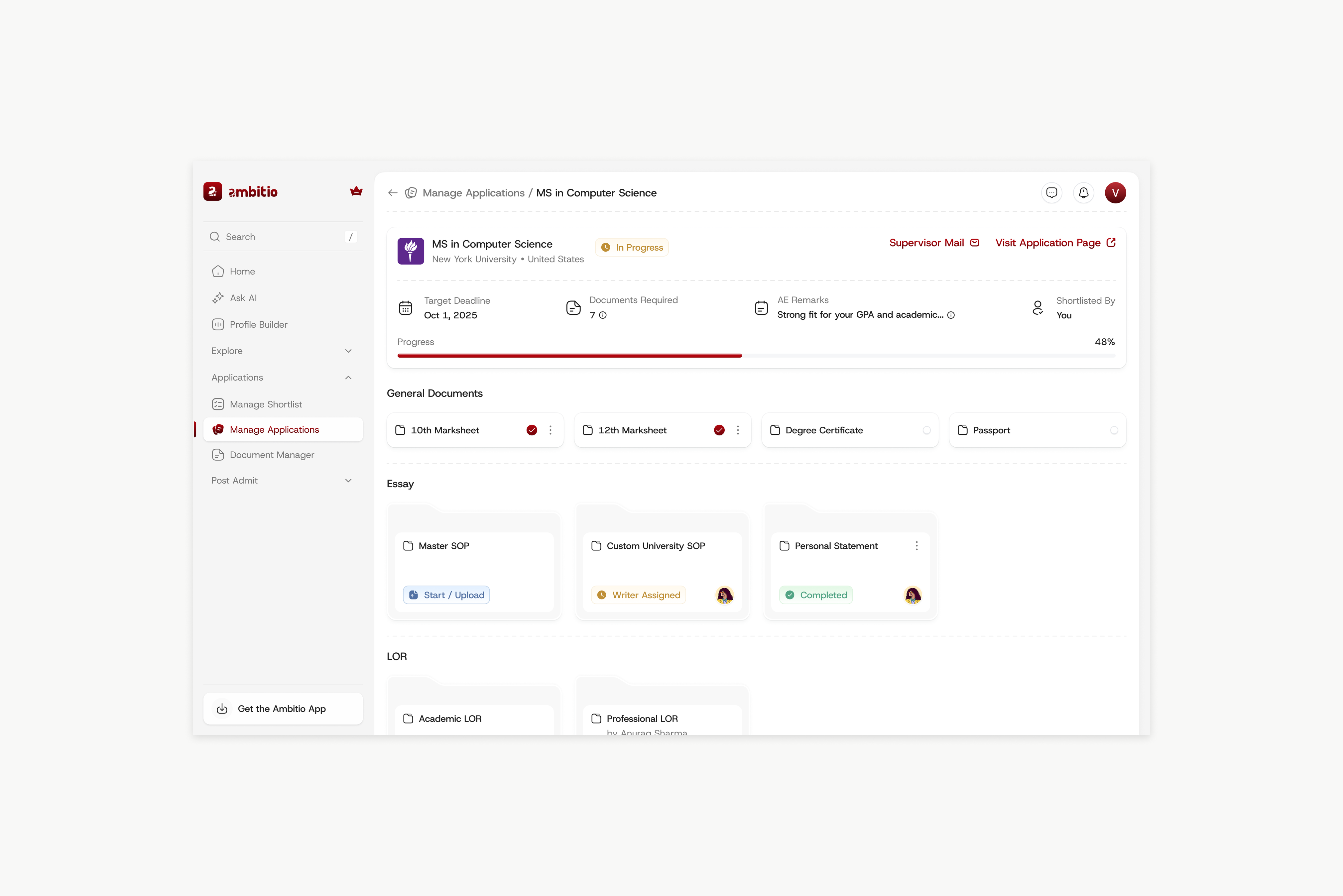
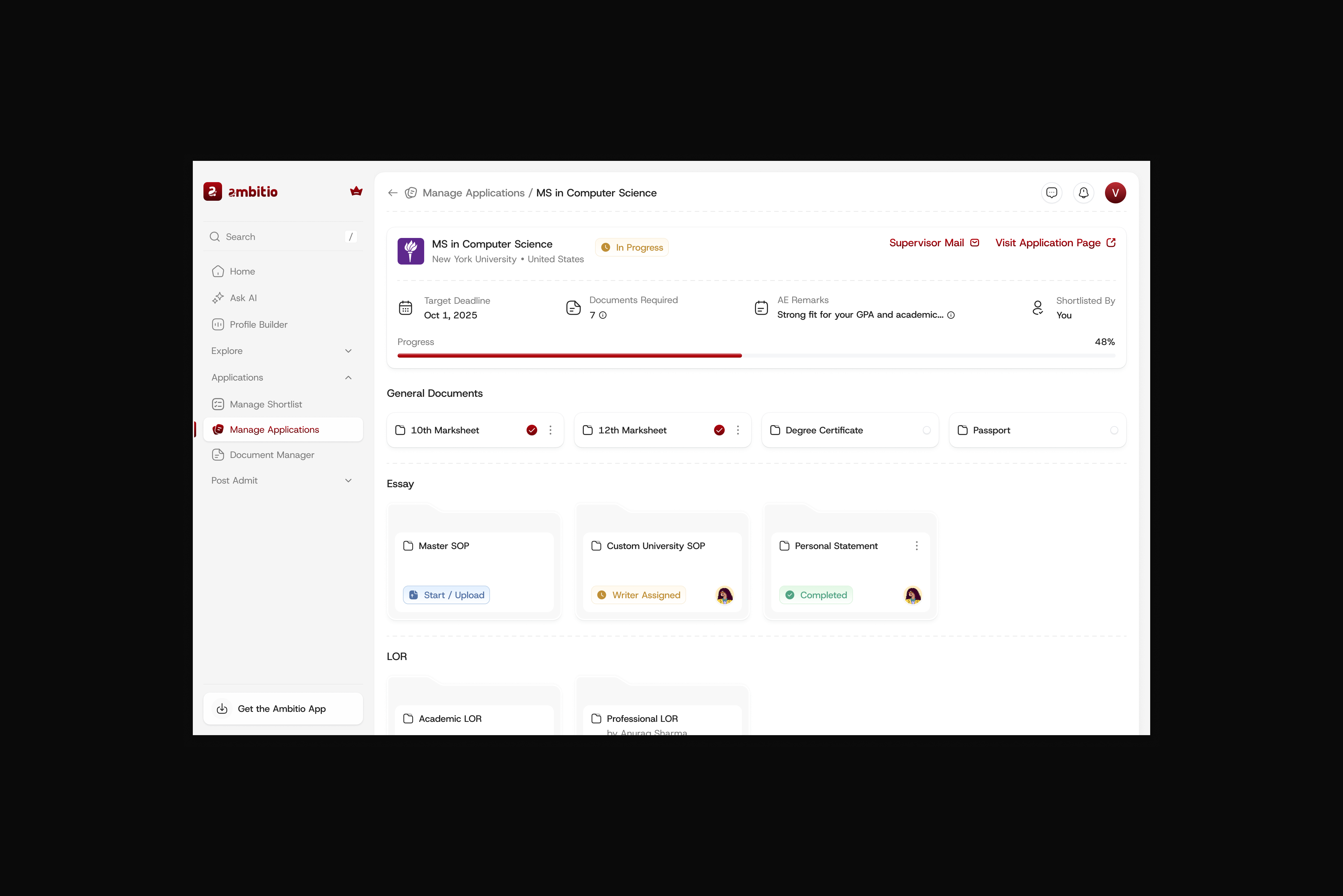
Status, deadline, documents, and progress, all in one place
3 · Documents that move, not pile up
Document Manager gives every SOP, LOR, and essay a clear owner and status (Writer assigned, Need review, Completed), so nothing stalls silently and students can see what's blocking a submission.
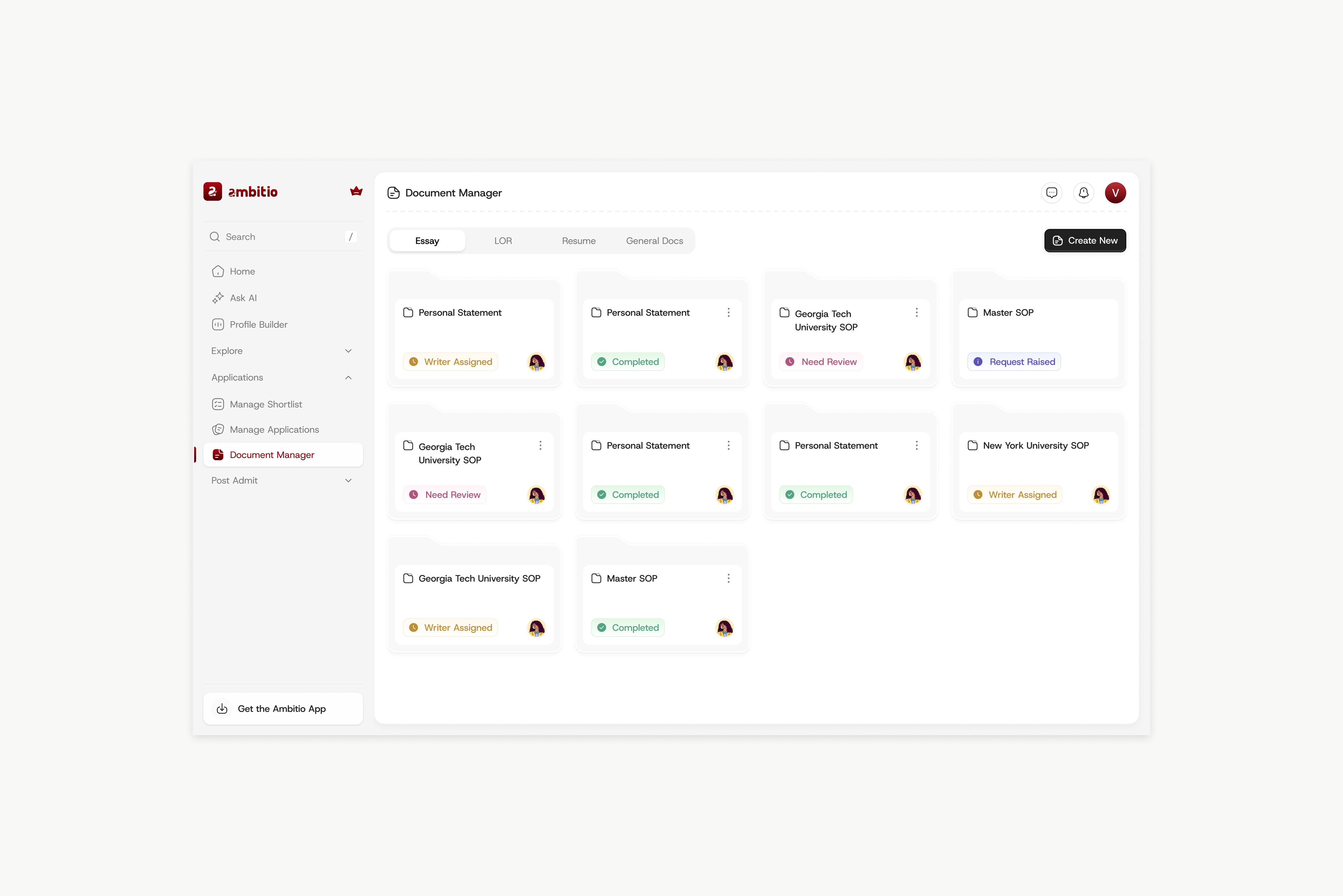
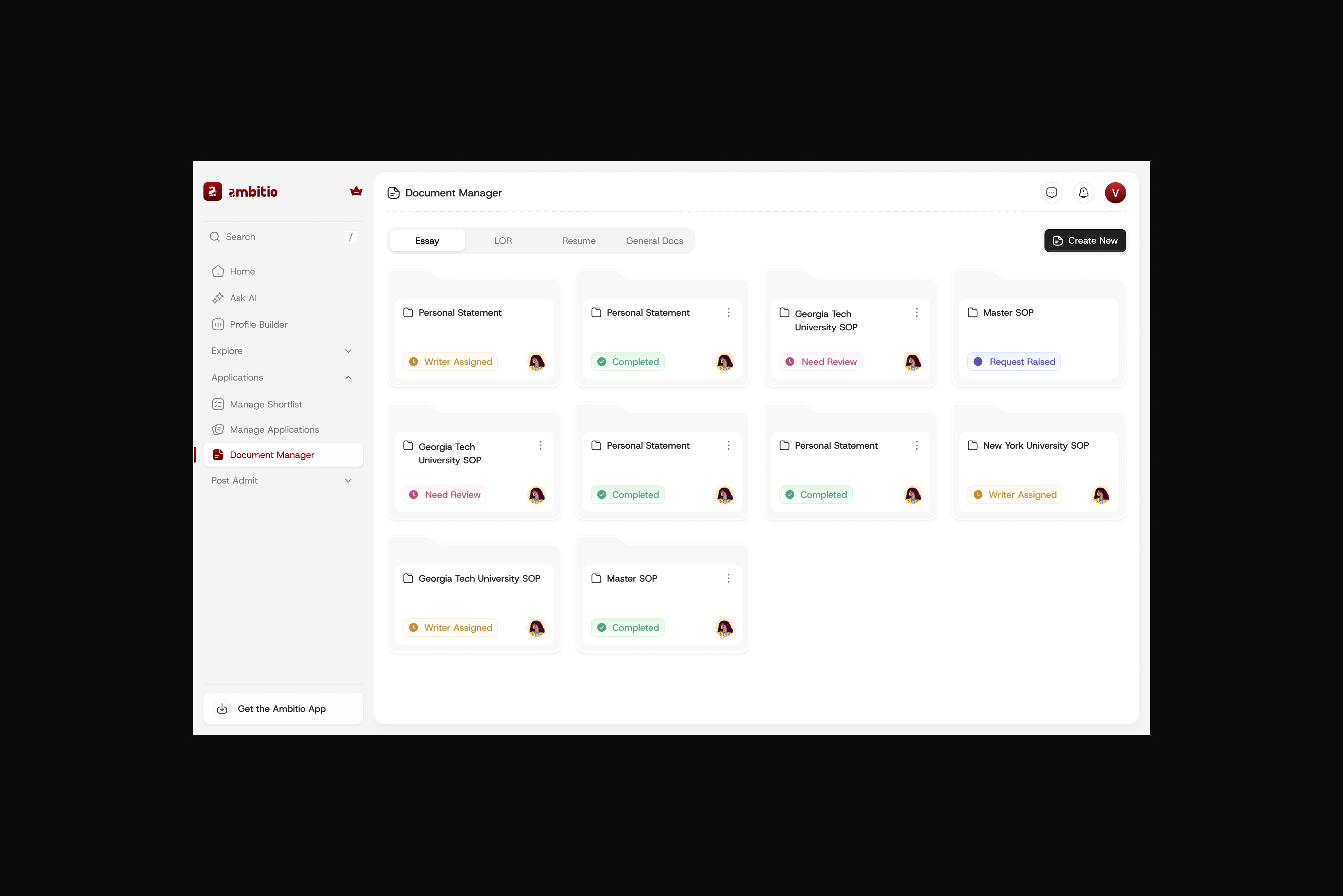
Every document organised by a clear, honest status
4 · Funding, surfaced instead of searched
Scholarship Finder brings relevant scholarships (amount, deadline, type, and country) into the same flow, so funding stops being a separate, forgotten task.
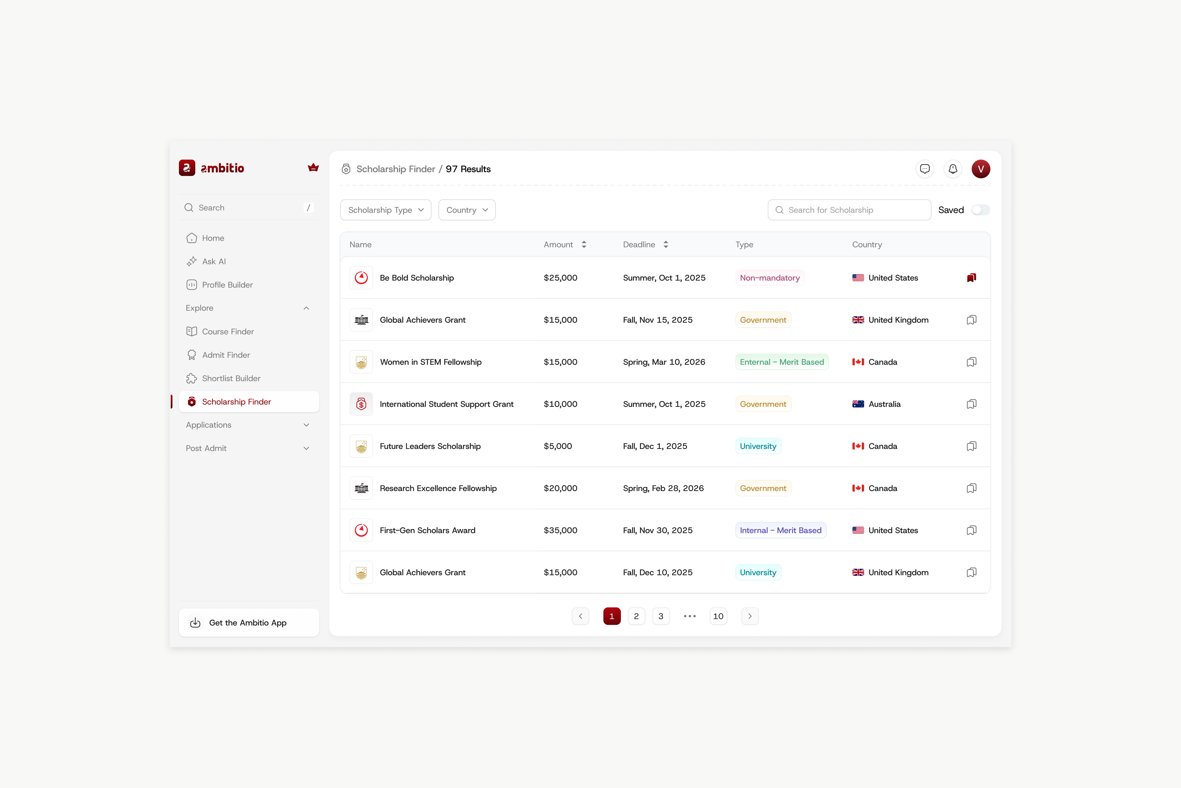
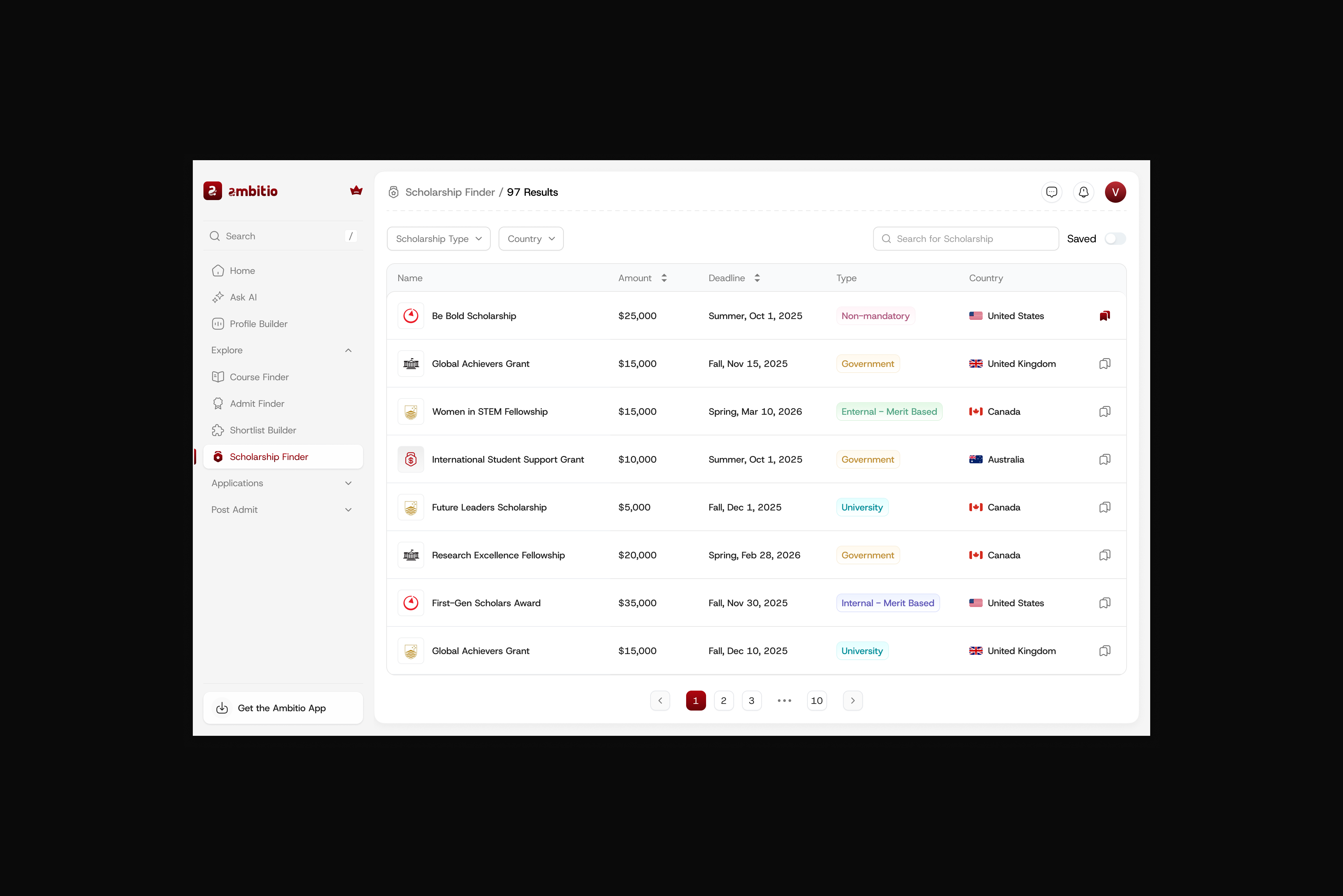
Relevant scholarships, right inside the application flow
Process
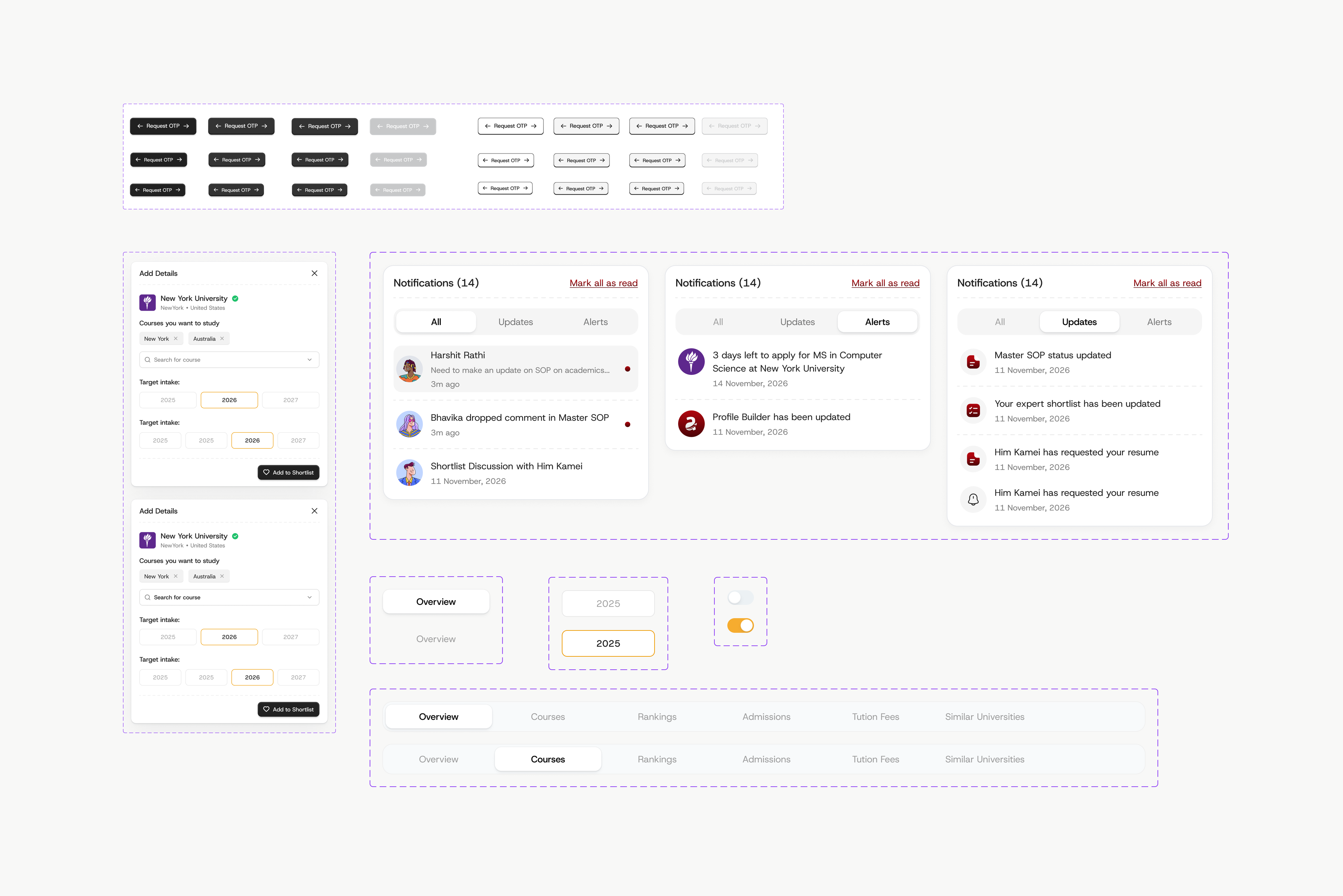
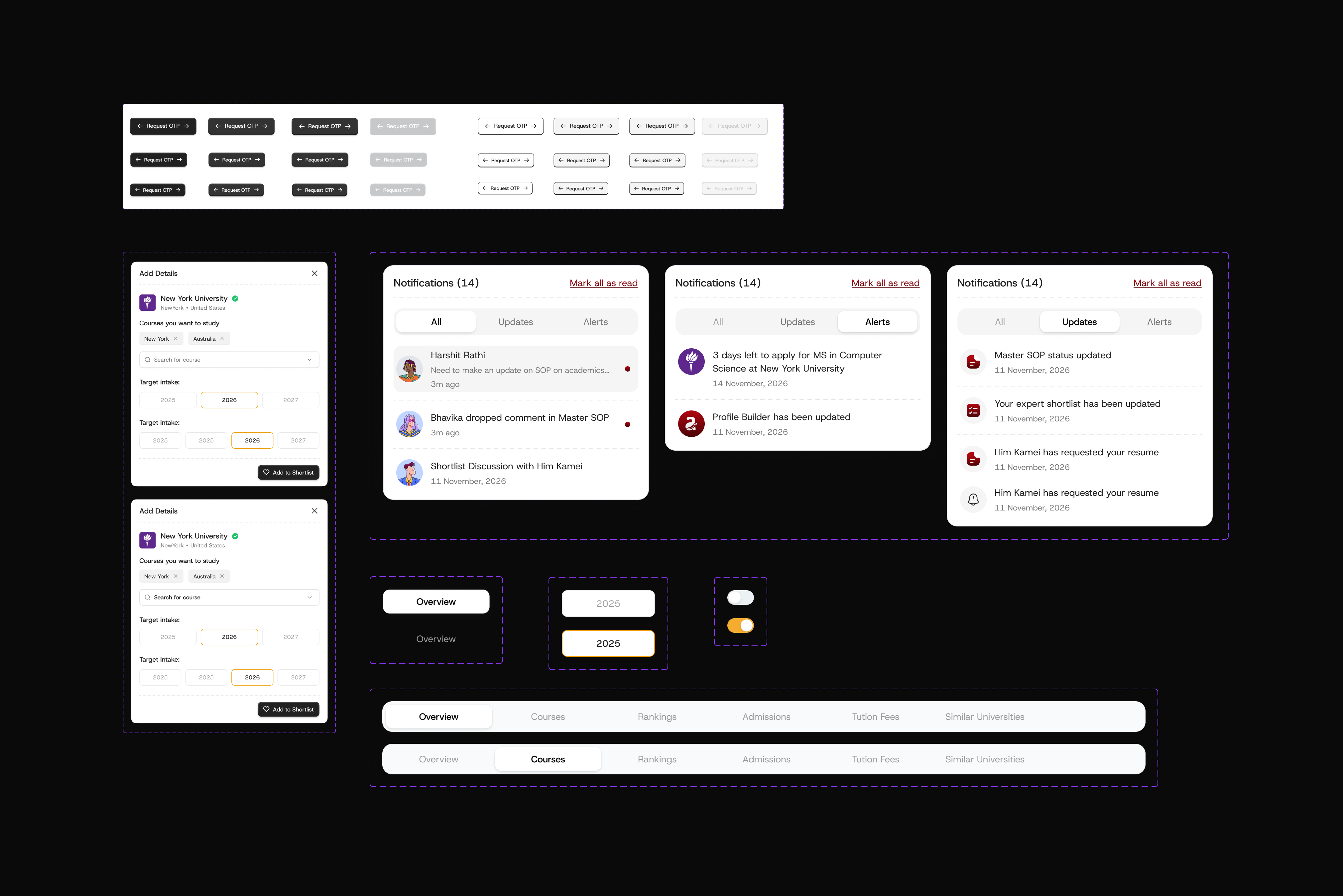
A system behind the screens
To keep 8+ surfaces consistent as the product kept growing, I built a shared component system (buttons, tabs, notifications, statuses, and steppers) so every new feature ships on-brand and predictable, and the whole product reads as one coherent journey.